

When it comes to medspa branding, choosing the right colors can significantly impact how potential patients perceive your business. Color theory is crucial in communicating your medspa brand’s values, creating an inviting atmosphere, and differentiating you from competitors. In this blog, we’ll explore the basics of color theory and offer actionable insights into how to create a cohesive color palette that aligns with your medspa’s services and mission.
Why Color Matters in Branding
Colors evoke emotions, create psychological connections, and shape first impressions. For medspas, where the environment is central to the patient experience, selecting the right colors can help convey your core values, whether it’s relaxation, luxury, or rejuvenation. Choosing the right palette not only influences how patients feel in your space but also ensures that your medspa brand is memorable and recognizable across all platforms.
Understanding Color Theory
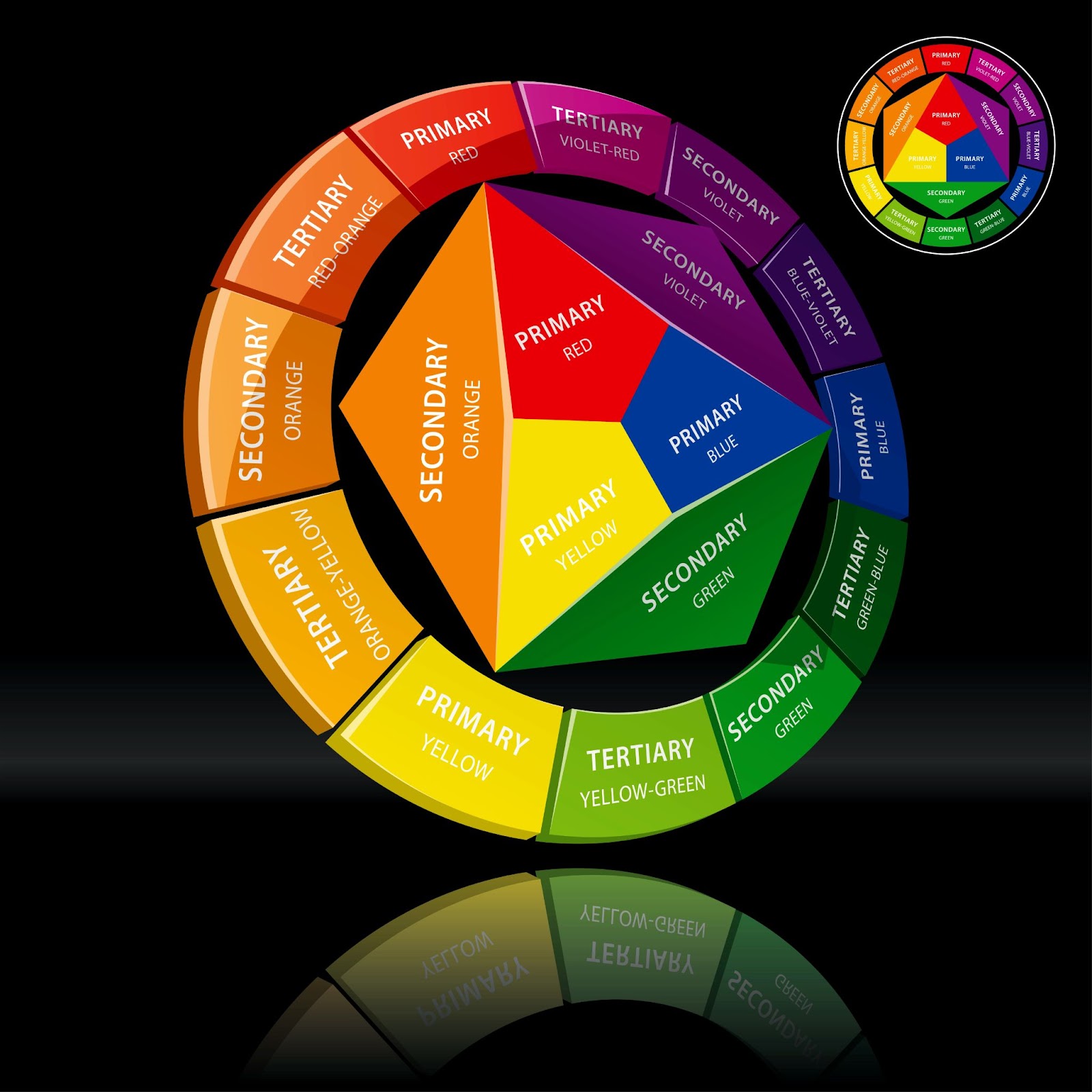
Color theory refers to the principles that guide how colors mix, match, and contrast to create visual harmony. By understanding primary, secondary, and tertiary colors, and how they interact with one another, you can strategically design a color scheme that conveys the right message. Here are a few key concepts to know:
- Primary Colors: Red, blue, and yellow are the foundational hues that can be mixed to create other colors.
- Secondary Colors: These are created by mixing two primary colors, such as green, orange, and purple.
- Tertiary Colors: Formed by blending primary and secondary colors, tertiary shades provide depth and variety to your palette.
Each color carries its own emotional and psychological impact, which you can leverage to enhance your medspa’s branding.
Applying Color Theory to Medspa Branding
1. Choosing Colors That Reflect Your Values
The colors you choose should directly reflect the values and services of your medspa. Here are some common associations:
- Calming Colors: Soft blues and greens are ideal for creating a tranquil, therapeutic environment that promotes relaxation and wellness. These hues are perfect for medspas focused on stress relief, massage, and holistic treatments.
- Luxurious Colors: Deep purples, golds, and rich tones evoke a sense of luxury and exclusivity. If your medspa caters to high-end clientele or offers premium services like advanced skincare and rejuvenation treatments, these colors help create an upscale feel.
2. Creating a Cohesive Color Palette
To build a strong brand identity, it’s essential to develop a cohesive color palette that includes both primary and secondary colors. This palette should be consistently applied across all medspa branding elements—from your logo and website to your marketing materials and physical spaces.
- Primary Colors: These are the dominant colors of your brand and should align with your core values.
- Secondary Colors: These hues complement your primary colors and add visual variety without overwhelming your brand’s message.
For example, a medspa focused on wellness may choose soft greens and whites as primary colors, with gentle accents of lavender or beige for a serene yet sophisticated look.
Maintaining Color Consistency Across Your Brand
Consistency in color use is key to reinforcing your brand identity. By applying the same colors across your digital and physical touchpoints, you create a unified, professional experience that builds trust and recognition.
Digital Presence
Ensure your website and social media profiles reflect your chosen color scheme. Use your brand colors in key areas like navigation bars, buttons, and background elements to enhance the user experience. Consistent use of color online helps create a cohesive digital presence that connects your brand’s identity with your services.
Marketing Materials
Apply your color palette to brochures, business cards, advertisements, and promotional flyers. Uniformity in color use strengthens your message and ensures patients instantly recognize your medspa, whether they find you online or through printed materials.
Bringing Color Into Medspa Branding Elements
1. Logo Design
Your logo is one of the most recognizable elements of your brand. Choose colors that reflect your medspa’s values and ensure they work well in different sizes and formats. A simple, versatile logo design with clear colors will make your brand memorable across both digital and physical platforms.
2. Physical Spaces
Color also plays a critical role in how patients experience your medspa’s physical location. Use calming shades in waiting areas to create a relaxing atmosphere, while treatment rooms should feature soothing colors that enhance comfort. Signage should be aligned with your medspa brand colors to maintain consistency throughout your space.
3. Website and Social Media
Color enhances the user experience on your website by providing readability and visual appeal. Choose colors that align with your branding while ensuring enough contrast for easy navigation. On social media, apply your color palette consistently in profile images, cover photos, and posts to reinforce your brand identity.
The Emotional Impact of Colors
Different colors evoke different emotional responses, which is why it’s important to select shades that align with the experience you want to provide:
- Soft Pastels: Colors like pale blue, soft pink, and mint green promote relaxation and serenity, perfect for spas focused on wellness.
- Bold Colors: While energizing and attention-grabbing, bold colors like red and bright yellow should be used sparingly to avoid overwhelming patients.
- Trust & Comfort: Shades of blue and green build trust and make patients feel safe, while luxurious tones like gold and deep purple convey exclusivity and high-end services.
Conclusion: The Key to Effective Medspa Branding
Using color theory effectively can transform your medspa’s branding, making it more appealing, recognizable, and aligned with your mission. From creating a relaxing environment to reinforcing luxury, the right color choices can elevate your patient’s experience and strengthen your medspa brand presence.
Key Takeaways:
- Understand the emotional impact of colors to make strategic choices for your medspa.
- Create a cohesive color palette that reflects your medspa brand’s values and services.
- Ensure color consistency across all medspa brand touchpoints to build trust and recognition.
- Regularly assess your color use to stay current with trends and patient preferences.
Ready to elevate your medspa’s branding through the power of color theory? Let the MedspaBloom team help you build a cohesive and impactful brand that resonates with your patients. We offer hourly bundles and can customize our services to fit your unique needs. Book a consultation today, and let’s work together to create a brand that sets you apart!
Don’t forget to connect with us to learn more medspa marketing tips and tips!
Share this content: