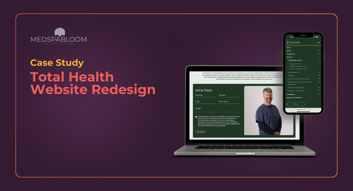
In today’s digital age, a well-designed website is essential for any healthcare provider looking to attract and retain patients. At MedspaBloom, we recently had the pleasure of partnering with Total Health, a clinic specializing in a variety of services such as chiropractic care, physical therapy, neuropathy treatment, and more. Our goal was to revamp their online presence, making it more user-friendly, informative, and visually appealing. Here’s how we transformed their website and what it means for businesses like yours.

Before
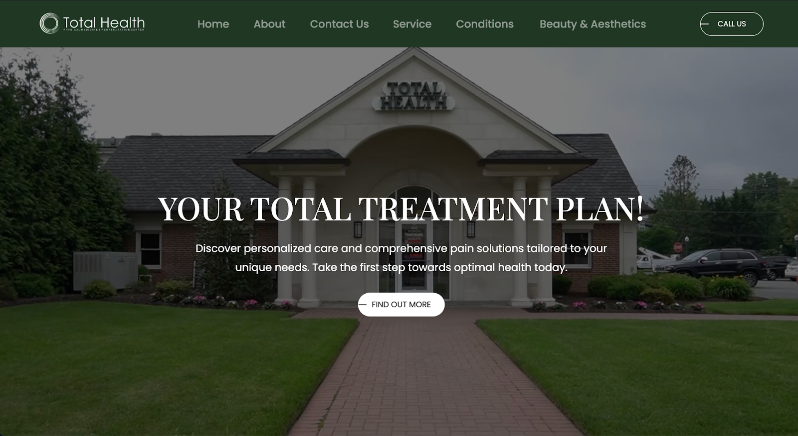
After
Identifying the Challenges
When we began working with Total Health, it was clear that their existing website was not meeting the needs of their patients. The site had several key issues:
- Difficult Navigation: Patients struggled to find the information they needed about services and treatments.
- Outdated Design: The overall aesthetic felt unprofessional and didn’t reflect the quality of care provided by the clinic.
- Lack of Patient Engagement: There were few calls to action, making it hard for visitors to take the next steps, such as booking appointments or asking questions.

Service Page Before
These challenges highlighted the need for a complete website redesign that would better serve both the clinic and its patients.
Our Approach: Patient-Centric Design
At MedspaBloom, we believe in a patient-first approach. Our redesign strategy focused on improving user experience and ensuring that patients could easily access relevant information. Here are the key elements of our approach:
- Streamlined Navigation: We restructured the site layout, making it easier for patients to find the treatments they were looking for. This redesign created a smoother browsing experience and improved overall site usability.
- Authentic Content Integration: We incorporated organic and authentic content that resonates with patients, fostering trust and credibility. This approach not only informs visitors but also strengthens their connection to the Total Health brand.
- Enhanced Visual Identity: The website received a modern aesthetic makeover, aligning its visual design with the professional care provided in the clinic. The new design reflects a contemporary and welcoming environment.
- Strategically Placed Calls to Action: Clear and inviting buttons like “Book a Consultation” and “Contact Us” were added throughout the site, encouraging visitors to take action and connect with the clinic.
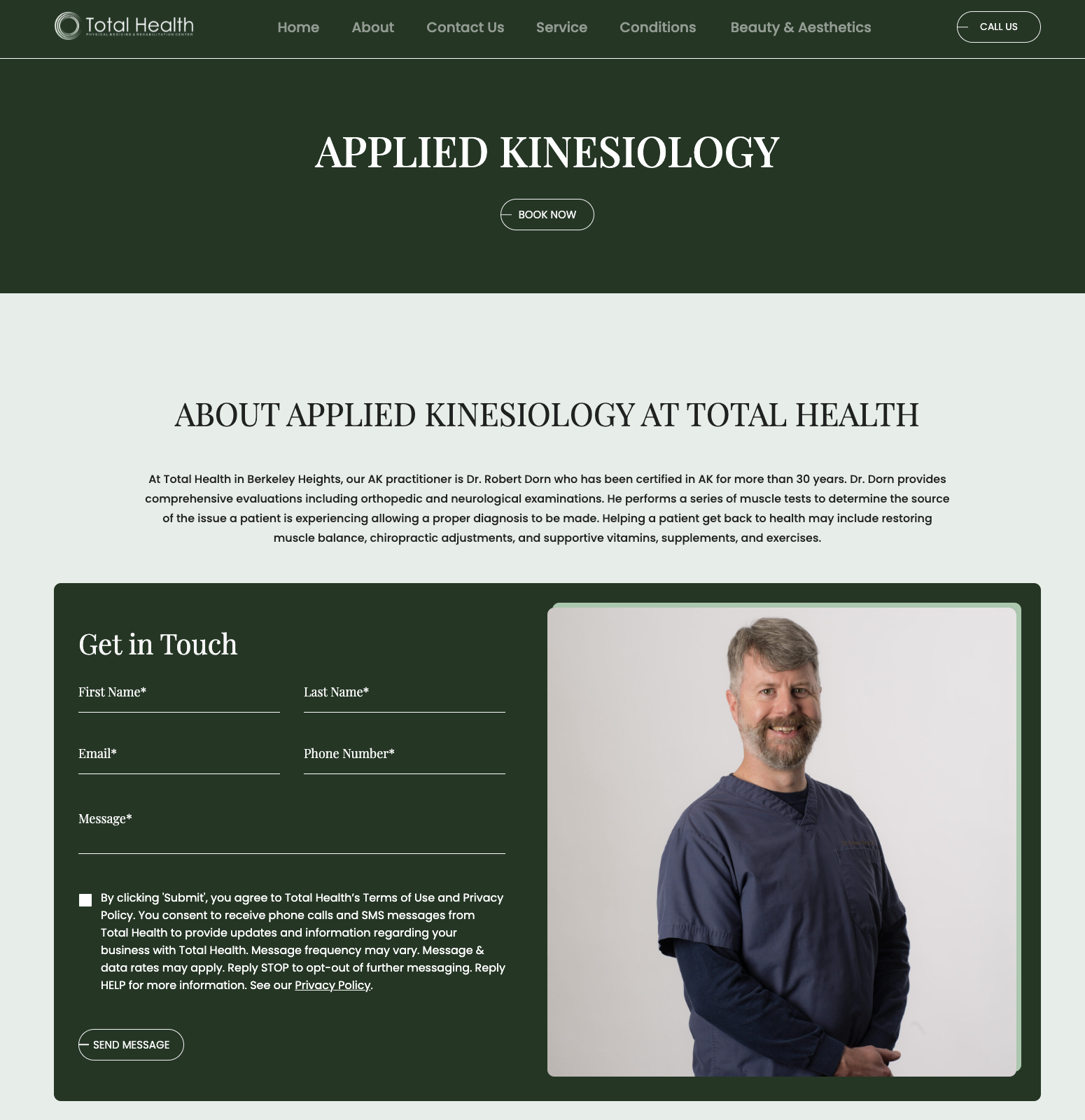
Service page after
Results and Impact
The results of our redesign were significant:
- Improved Site Navigation: Patients can now effortlessly find information about services, leading to a more efficient experience.
- Patient-Centered Design: The new layout prioritizes the needs of patients, ensuring they have access to the resources they need without frustration.
- Stronger Brand Identity: The updated design reinforces Total Health’s professional image, aligning their online presence with the quality of care they provide in person.
- Potential for Increased Visibility: With better-organized content, the site is positioned for SEO to attract more visitors through search engines, enhancing its discoverability.
- Flexibility for Future Growth: The new website structure allows for easy updates and additions, enabling Total Health to expand its services seamlessly.
Reflecting on Your Own Website
At MedspaBloom, we are committed to helping businesses like Total Health enhance their digital experiences. This case study serves as a reminder of the importance of a well-designed website in today’s competitive landscape.
Is your website meeting the needs of your patients? Are you effectively communicating your brand’s value? If you find yourself questioning your online presence, it may be time for a redesign.
Let’s Start the Conversation!
If you’re ready to take the next step, reach out to MedspaBloom. Together, we can create a digital experience that not only attracts visitors but also fosters lasting patient relationships. Get started today with a free website audit!
Share this content:
